With a trusted reference image in hand, you can evaluate a suspect card using only the seller's photos: ideal for screening online listings before purchase. These checks help you decide whether a card is worth pursuing before you have it in hand.
Wrong Holo Pattern
Authentic holos use proprietary foil technology that creates smooth, flowing light sweeps – one of the hardest elements for counterfeiters to replicate.
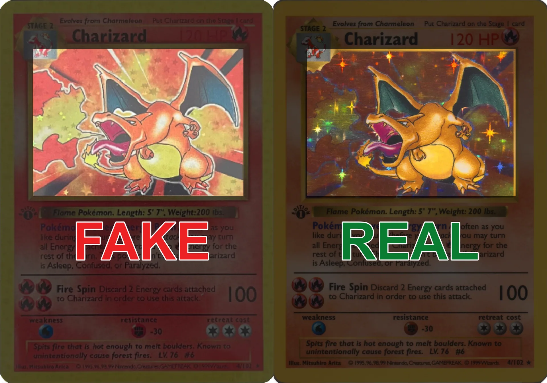
- Compare at matching angles: When sellers photograph holos at angles to showcase foil effects, compare directly against reference images captured at similar perspectives.
- Fake tells: Short repeating loops, scattered hotspots, patchy reflections, overly "glittery" sparkle, static appearance, or unnatural rainbow artifacts – authentic cards show smooth, flowing sweeps.
- Request more photos: If the holo effect isn't clearly visible, ask for additional angles. Seller reluctance is itself a warning sign.
- Shadow placement (vintage): On cards like 1st Edition Charizard, the shadow behind the Pokémon must align precisely with the artwork – check for shadows that are too dark, too light, or shifted.
- Pattern consistency: Authentic patterns extend uniformly across the holographic area. Watch for dead zones, uneven brightness, or abrupt pattern changes.
Spelling Mistakes
Spelling and text errors are among the easiest red flags to spot: counterfeiters often work from low-resolution scans or non-native language sources, introducing mistakes that never appear on authentic cards.
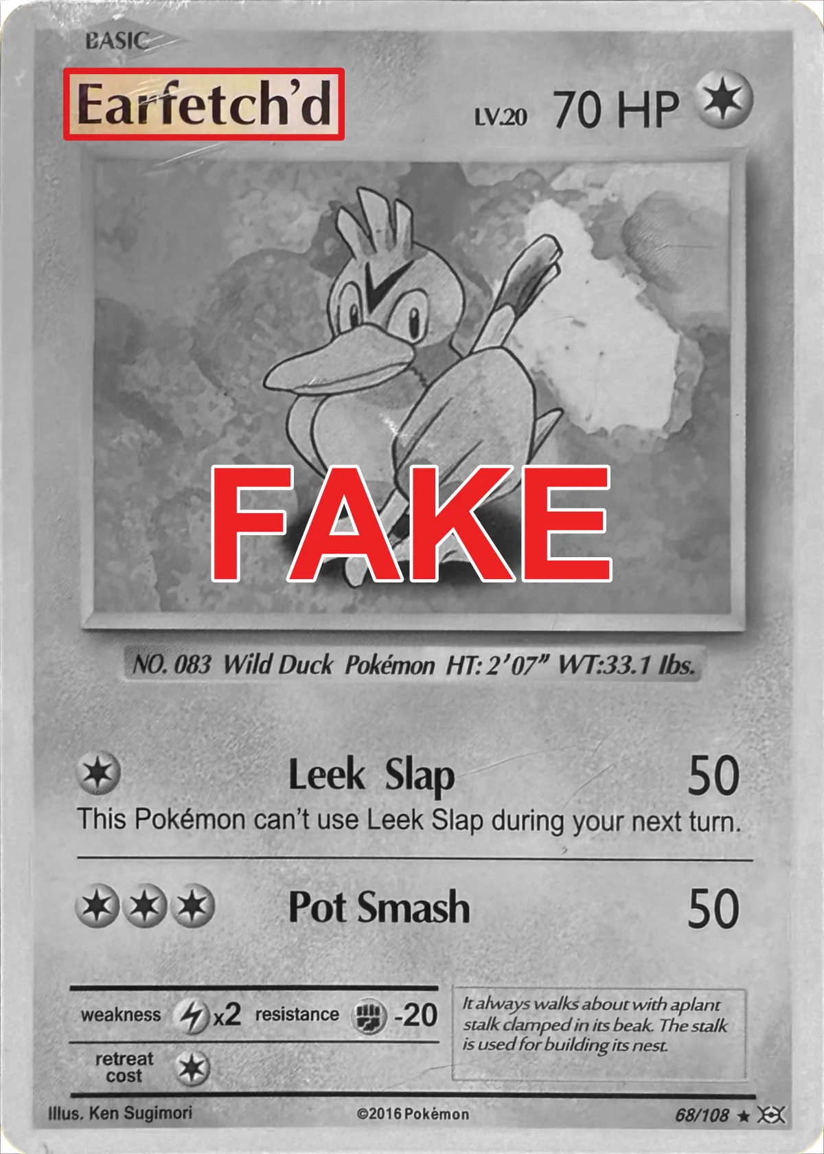
- Check the Pokémon name: On an English card where the word “Pokémon” is expected, confirm the accent is present (
é, note). Missing or incorrect accents are a strong warning, but first confirm the exact language and printing against a trusted reference. - Attack and ability text: Compare every word against your reference. Common errors include misspelled attack names ("Flamethower" instead of "Flamethrower"), garbled ability descriptions, or nonsensical phrasing.
- Energy symbols: Attack costs should display the correct energy type icons. Fakes sometimes substitute wrong symbols or use low-resolution versions that appear pixelated.
- Line breaks and spacing: Authentic cards have precise text layout. If line breaks occur in different places than the reference, or if spacing between words looks uneven, the card was likely printed from a poor source file.
- Ligatures: Professional printing uses proper ligatures for letter pairs like "fi" and "fl." Fakes may show these letters separated or overlapping awkwardly.
- Copyright text: Check the bottom copyright line for correct spelling of "Pokémon," "Nintendo," and other trademark holders. Errors here are common on low-effort fakes.
Wrong Font
Pokémon cards use specific proprietary fonts that counterfeiters rarely replicate perfectly. Font differences are often visible even in standard listing photos without magnification.
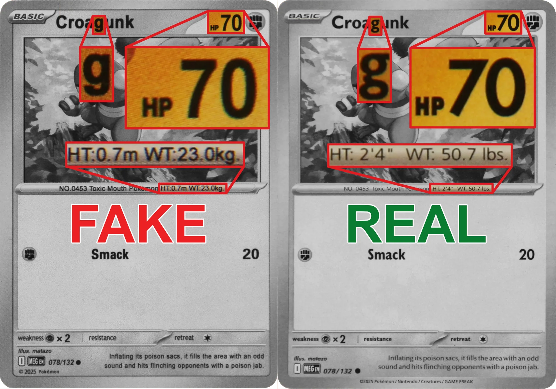
- HP numerals: Authentic HP numbers have distinctive squared counters (the enclosed spaces in numbers like 0, 6, 8, 9). In listing photos, check whether numerals appear bubbly, rounded, or feathered compared to reference images.
- Text crispness in photos: Even in standard-resolution listing photos, authentic text appears clean and sharp. Look for visible magenta or cyan halos around black text: a sign of poor color separation during printing.
- Letter shapes: Compare individual letters in the listing photo against your reference. Pay attention to:
- The curve of lowercase "e" and "a"
- The tail of lowercase "g" and "y"
- The crossbar height on "t" and "f"
- The width of capital letters like "M" and "W"
- Stroke weight: Authentic fonts maintain consistent stroke thickness. In photos, look for uneven weights: thin strokes that nearly disappear or thick strokes that blob together.
- Spacing (kerning): Letters should be evenly spaced. Cramped or overly loose letter spacing visible in listing photos indicates a font substitution or poor reproduction.
Wrong Elements Position
Every element on a Pokémon card has a precise position defined by the official template. Counterfeiters working from scans or recreated layouts frequently misplace elements by small but detectable amounts.
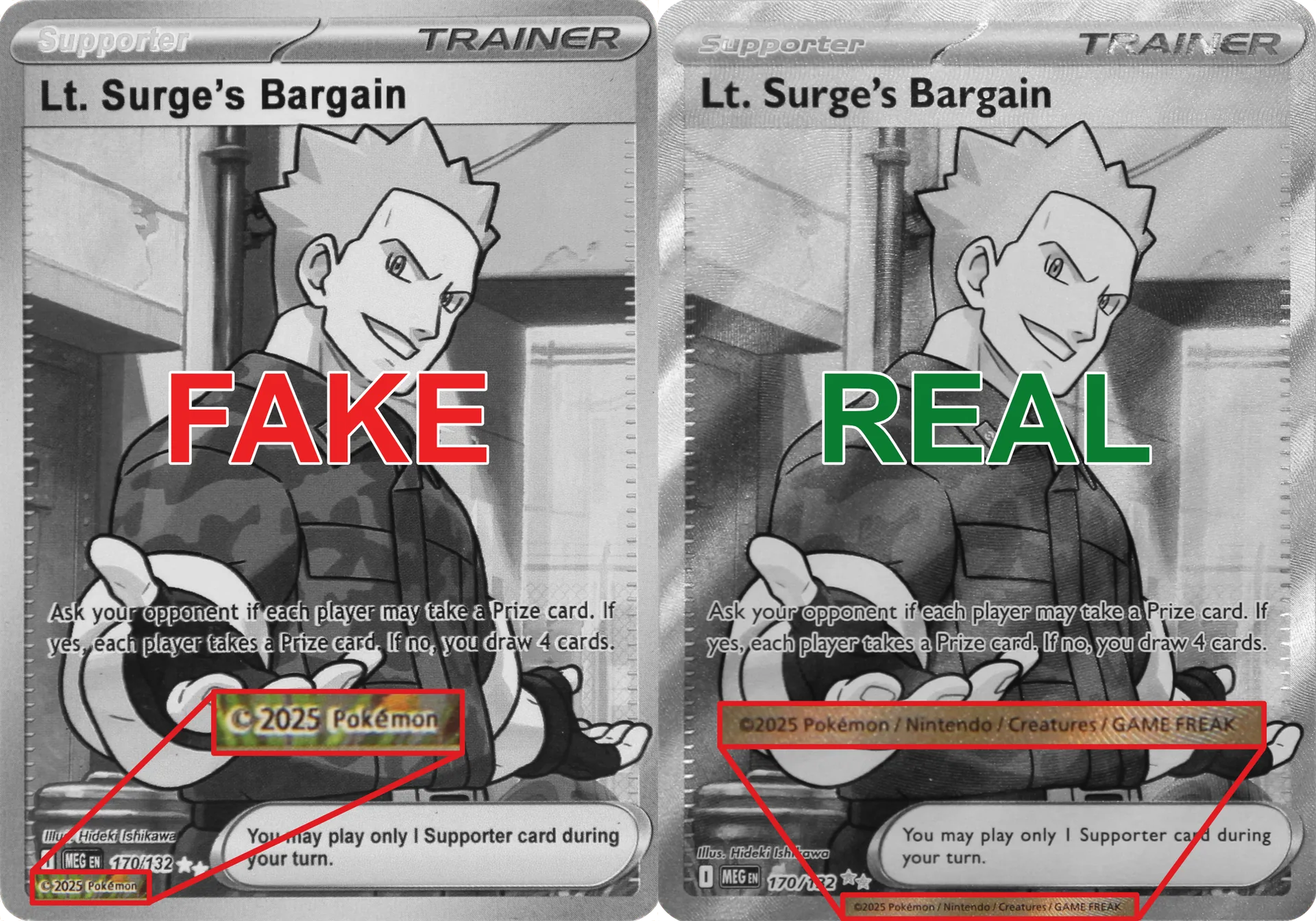
- Set symbol and rarity icon: These should sit in identical positions relative to the text boxes and card edges. Compare the listing photo side-by-side with a reference; even small shifts are often visible.
- Regulation marks: Modern cards display regulation marks (letters like "E," "F," "G") in specific positions. Check that the mark exists in the listing photo, uses the correct letter for the set's era, and sits in the proper location.
- Text box alignment: Rule boxes, attack boxes, and ability descriptions should align precisely with the reference. In listing photos, watch for:
- Boxes that are stretched horizontally or vertically
- Stroke widths that appear thinner or thicker than authentic
- Rounded corners that look too sharp or too soft
- Copyright line: The copyright text at the bottom should align consistently. On Lt. Surge's Bargain and similar vintage cards, check that the copyright year, trademark symbols, and company names sit in the correct positions relative to the card edge.
- Artwork centering: The illustration should be centered identically to the reference. Shifted artwork visible in listing photos, even by a few millimeters, suggests the card was printed from a misaligned template.
Wrong or Absent Texture (Visual)
Many modern Pokémon cards feature embossed or textured surfaces that are difficult to replicate. These textures are often visible in high-quality listing photos, making them useful for remote authentication.
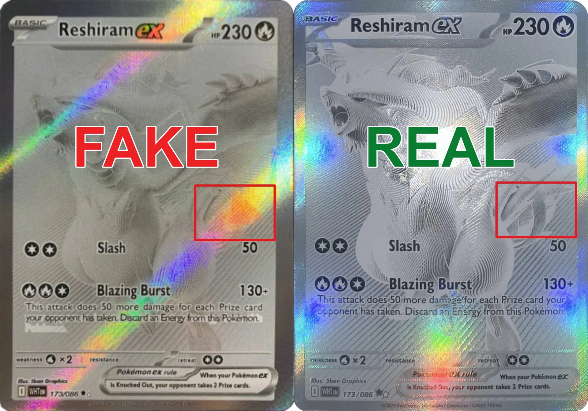
- Card types with texture: Many Full Art and other premium cards have textured surfaces, but texture is specific to the exact card, set, and printing. Confirm that the particular variant should be textured before treating its absence as suspicious.
- What to look for in photos: Authentic textures display fine, even micro-ridges that follow specific patterns: often radiating lines, crosshatches, or swirling designs that complement the artwork. Good listing photos taken at an angle will reveal these patterns.
- Spotting texture in seller photos: When sellers photograph cards at angles (common for showing holo effects), authentic texture casts consistent micro-shadows. Fakes typically show flat, uniform glare with no shadow variation.
- Pattern consistency: In listing photos, the texture should extend uniformly across the designated areas. Watch for:
- Dead zones where texture abruptly stops
- Inconsistent depth (some areas deeper than others)
- Texture that doesn't follow the expected pattern for that card type
- Texture vs. print pattern: Don't confuse printed texture effects with actual embossing. Authentic textured cards show physical depth through shadow patterns in photos; printed fakes appear flat even when photographed at angles.
Stock Image Holo Match
Counterfeiters often copy stock images from TCGPlayer or PriceCharting to print their fakes. Since authentic holo patterns are unique to each card, a fake printed from a stock photo will display that exact same holo pattern: a telltale giveaway.
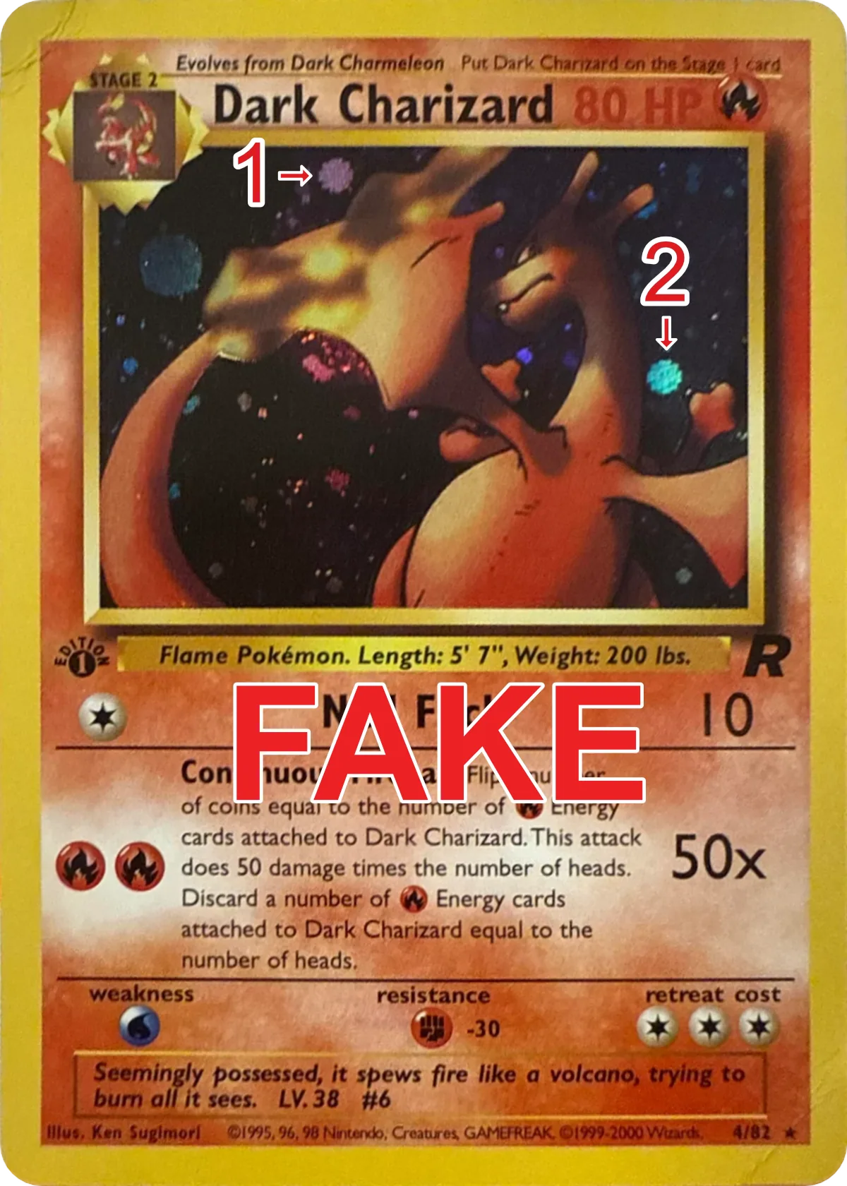
For additional context, see this Reddit discussion.
How to Use This Technique
Find the stock image: Navigate to TCGPlayer or PriceCharting and locate the card you want to verify.
Compare the seller's photo: If the holo pattern matches the stock image exactly – same bright spots, same reflection angles, same light distribution – this is a major red flag.
Use a side-by-side workspace: Open the suspect image next to a reference in Shinydev TCG when you want to zoom into matching landmarks such as wings, claws, borders, or text boxes.
Limitations
- This method only catches fakes made from stock images. Higher-quality counterfeits may use original scans.
- Lighting conditions in seller photos can make comparisons difficult.
- Some legitimate resellers may use stock images in their listings rather than photos of the actual card: always request real photos before purchasing high-value cards.